Using Headings for Accessibility
Why Headings Are Important
Headings provide essential structure for web content and play a critical role in accessibility. When used correctly, headings help all users quickly understand the organization of a page and find the information they need.
For people who use screen readers or keyboard navigation, headings act as navigation points that allow users to move through content efficiently. This page provides guidance for creating clear, well-structured headings that support accessibility, improve readability, and ensure CWU web content is usable and aligned with digital accessibility standards.
Using Headings Accessibly
Using Headings Accessibly
Headings are one of the most important tools for creating clear, accessible web content. They provide structure, help users scan a page, and allow people using screen readers to navigate content efficiently. When headings are used correctly, they improve usability for everyone.
Use Headings to Organize ContentHeadings should describe the topic of the content that follows and reflect the overall structure of the page. Use headings to break content into logical sections, similar to an outline.
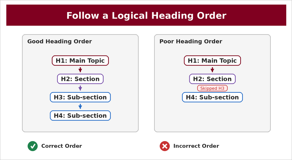
Follow a Logical Heading OrderHeadings must follow a clear, hierarchical order. Start with a single H1 that describes the main topic of the page, then use H2 headings for major sections. Use H3 and lower-level headings only to subdivide content under the preceding heading level. Do not skip heading levels (for example, jumping from H2 to H4).
Headings should not be used to make text look larger or bolder. Use built-in heading styles rather than manually formatting text so assistive technologies can correctly interpret the page structure.
Keep Headings Clear and DescriptiveHeadings should be concise and clearly describe the content in the section. Avoid vague headings such as “More Information” or “Overview” without context.
Avoid Overusing HeadingsNot every piece of text needs to be a heading. Use headings intentionally to group related content and guide users through the page.
One H1 per PageEach page should have one H1 that clearly identifies the page’s main purpose. Additional headings should follow in logical order beneath it. In CascadeCMS the H1 is generated from the Headline field in the Masthead section. Ensure that this field is filled out and that the Headline is unique and serves to introduce the topic of the page.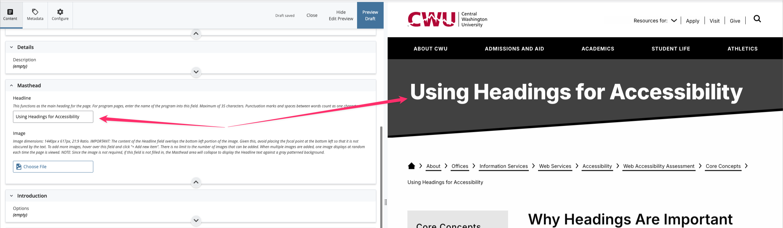
- Before publishing, review the page to ensure headings:
- Are used in order and do not skip levels
- Accurately describe the content that follows
- Are created using proper heading styles, not visual formatting
Using headings consistently and correctly helps ensure CWU’s web content is accessible, readable, and easy to navigate for all users.
-
Common Heading Accessibility Errors
The following are common mistakes that can make headings confusing or inaccessible on the CWU website. Avoiding these errors helps ensure content is easy to navigate and usable for all users, including those who rely on assistive technologies.
- Skipping heading levels, such as jumping from an H2 directly to an H4, which breaks the logical structure of the page.
- Using headings purely for visual styling instead of to represent content structure.
- Creating multiple H1 headings on a single page instead of using one clear main heading.
- Using vague or non-descriptive headings that do not clearly identify the content that follows.
- Applying bold text or font size changes instead of built-in heading styles.
- Placing headings out of order when content is rearranged or copied from other sources.
- Using headings for decorative text, labels, or navigation elements that are not section titles.
- Failing to update headings when page content changes, resulting in mismatched or misleading section titles.
- Nesting headings incorrectly or overusing lower-level headings without clear hierarchy.
- Omitting headings altogether and presenting long blocks of text without structure.
Addressing these common errors helps ensure CWU web content is well organized, accessible, and aligned with digital accessibility standards.
-
Best Practices for Using Headings Accessibly
Use the following best practices to ensure headings on the CWU website are clear, meaningful, and accessible to all users.
- Use headings to organize content and communicate structure, not for visual styling.
- Start each page with a single H1 that clearly identifies the main topic or purpose of the page.
- Follow a logical heading order, moving sequentially from H1 to H2 to H3 and so on without skipping levels.
- Use H2 headings to identify major sections of the page and lower-level headings only to subdivide related content.
- Write clear, descriptive headings that accurately reflect the content that follows.
- Use built-in heading styles provided by the CMS rather than manually formatting text.
- Keep heading text concise while still being meaningful and specific.
- Ensure headings remain in the correct order when content is edited, moved, or copied from other sources.
- Avoid overusing headings or creating unnecessary heading levels.
- Review the page structure before publishing to confirm headings form a logical outline.
Following these practices helps ensure CWU web pages are easy to navigate, readable, and aligned with accessibility standards.
CWU News

CWU Music faculty, students find harmony with annual SLYM camp
July 20, 2026 by David Leder

Douglas Honors College at CWU to celebrate 50 years (part 1)
July 15, 2026 by Tran Nha Pham